 NICEtoREADtoo
What’s new in the app for readers: eighteen styles, a guide with videos and better accessibility
NICEtoREADtoo changes its look whenever you like, works better for people who use a screen reader and explains every section with a short video
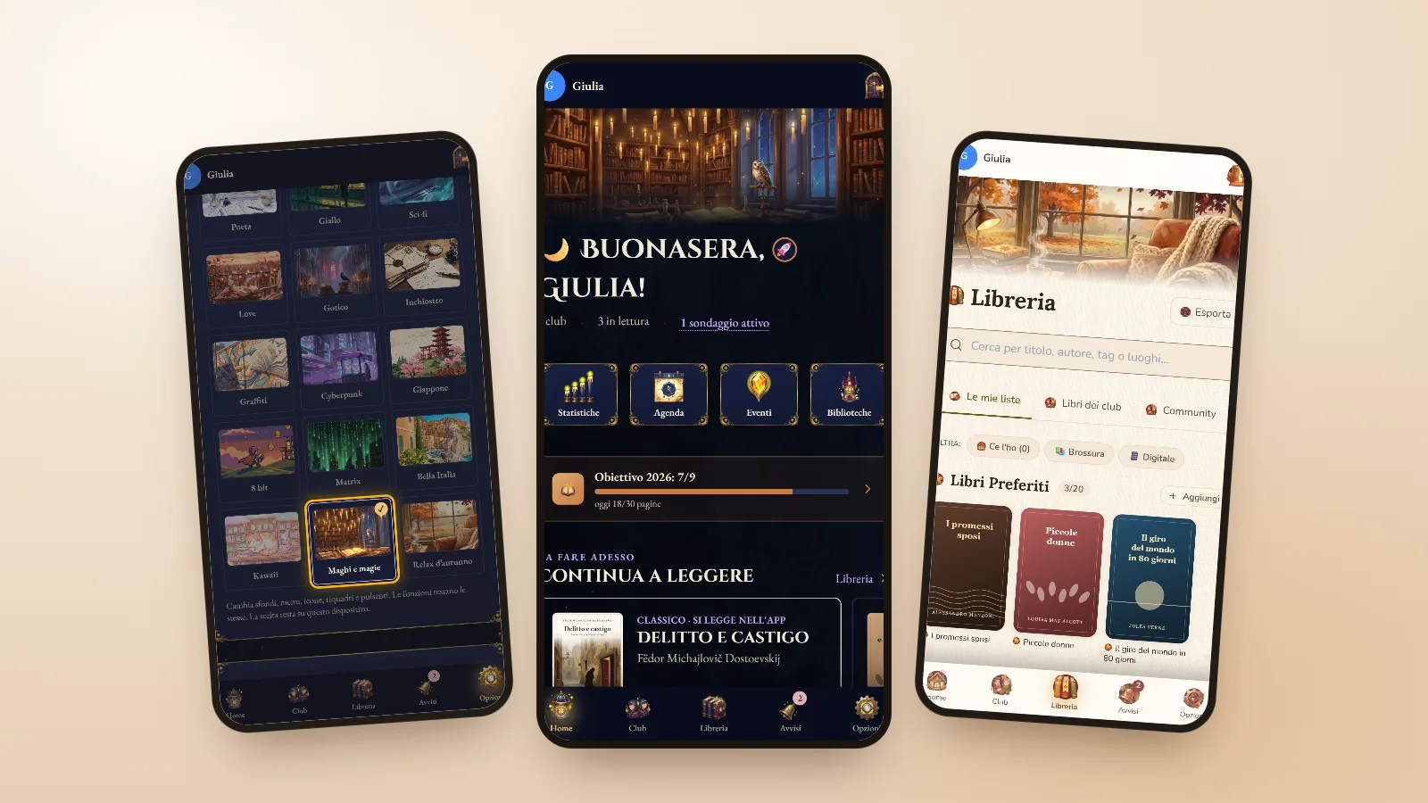
Every reader has a favourite corner, the armchair by the window, the kitchen table on a Sunday morning, the train to work, and we liked the idea that the app could look a little like that corner too. In the last few weeks we worked on exactly this, together with two less visible but just as important things: making NICEtoREADtoo easier to use for people who hear the screen read aloud, and explaining every section of the app for readers more clearly.
Here is what changed, section by section.
Eighteen styles to dress the app
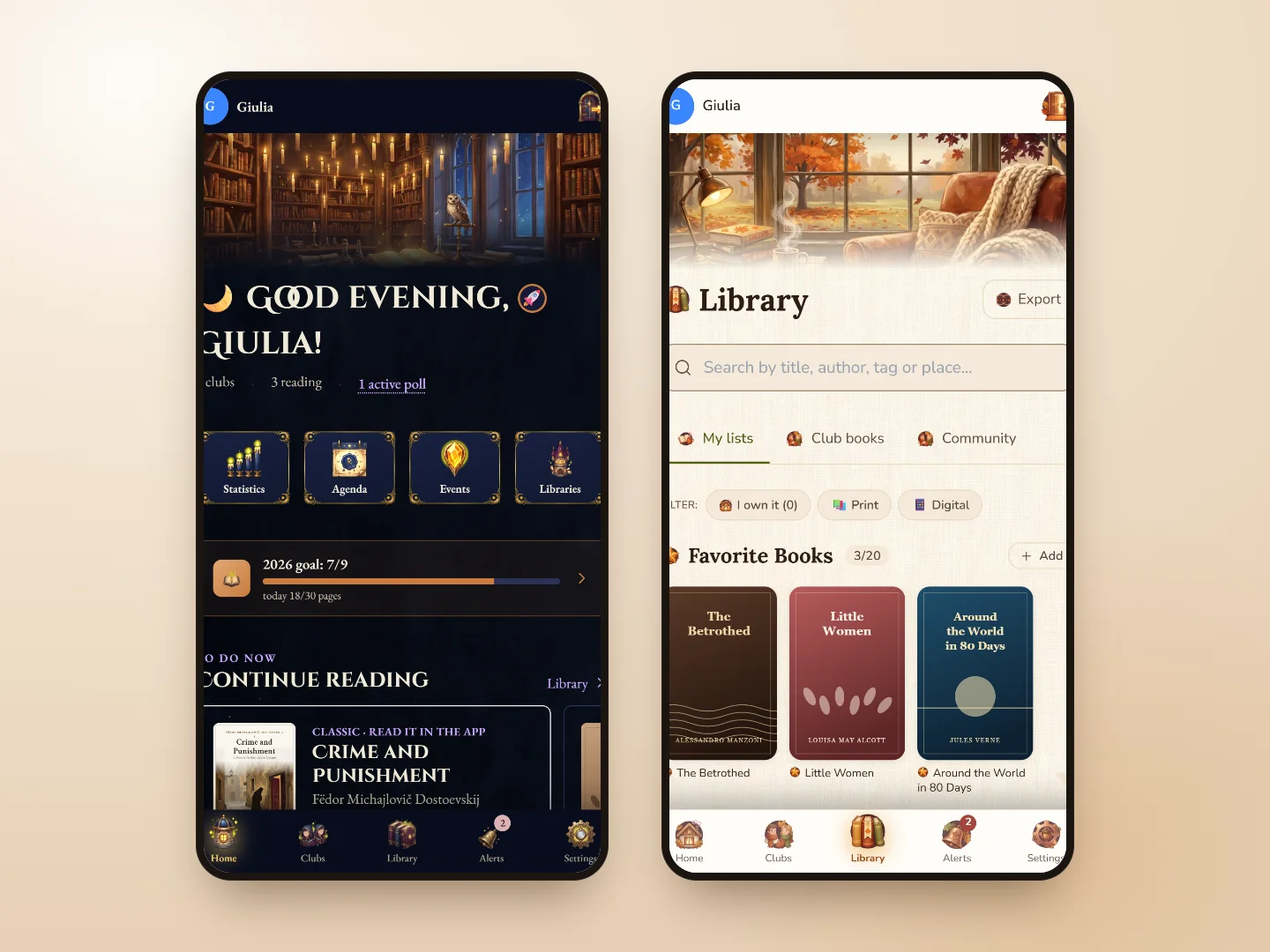
With app styles you change the look of the whole of NICEtoREADtoo with one tap: backgrounds, menus, icons, panels and buttons are painted, and each style has its own mood. They range from the usual Classico to Classico nuovo, from the paper and ink of Poeta to the cherry blossoms of Giappone, all the way to the candle-lit library of Maghi e magie and the reading nook of Relax d’autunno, with its wool blanket and hot tea.
Every feature stays the same, only the clothes change: your lists, your clubs, the classics reader and your statistics are always in their place. The choice stays on the device, so you can have one style on your phone and another on your computer.
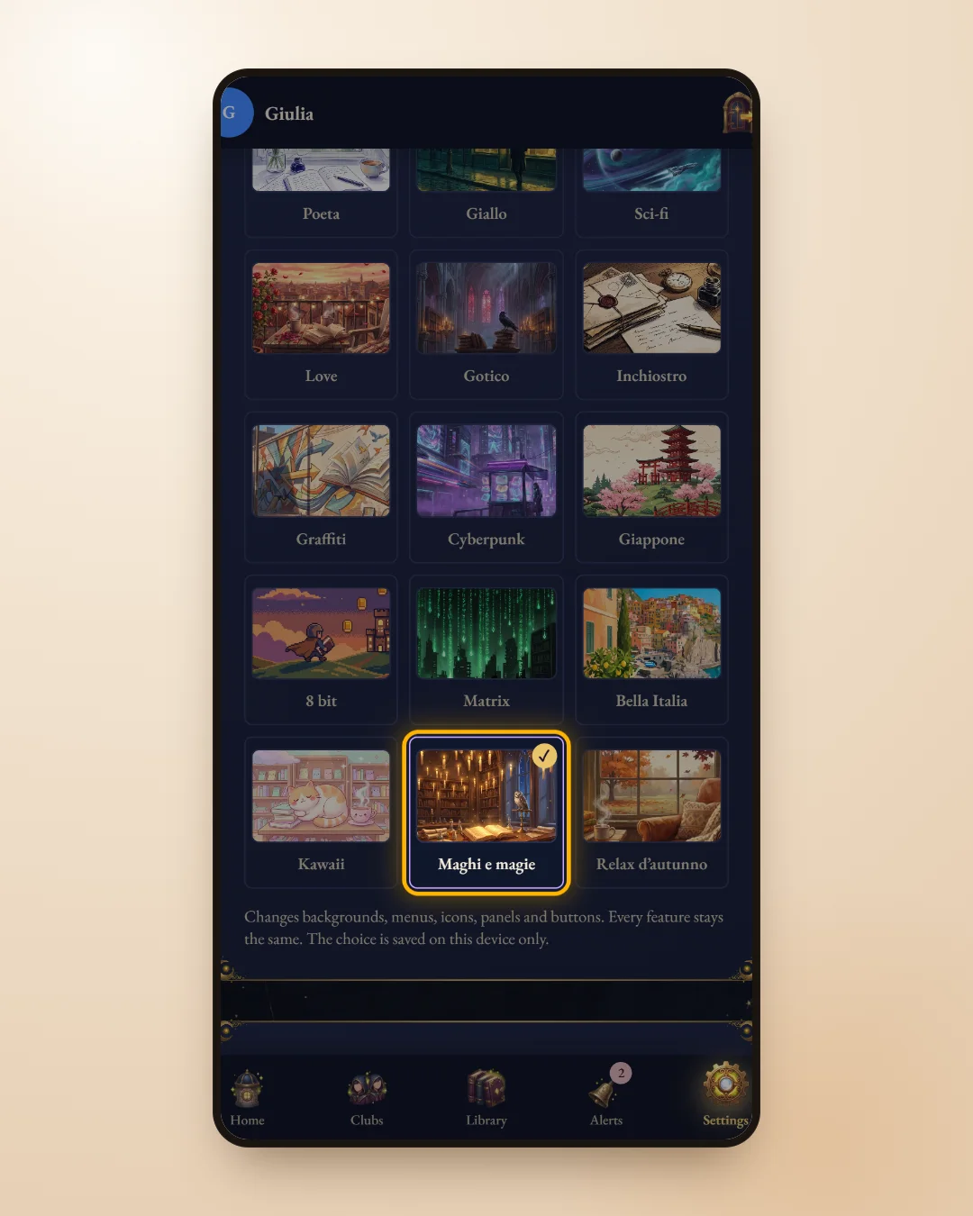
To choose one, open Settings and go to App style: tap a preview and the style applies right away, on every page. To go back to the usual look, just choose Classico.
Which styles come with your plan
Classico, Classico nuovo, Poeta, Inchiostro and Giappone are for everyone, on the free plan too. The others have a small padlock and come with the Plus, Premium and Premium Plus plans: tapping one opens the plans page, where you also see what each plan includes.
- For everyone: Classico, Classico nuovo, Poeta, Inchiostro, Giappone.
- With the paid plans: Fantasy, Giallo, Sci-fi, Love, Gotico, Graffiti, Cyberpunk, 8 bit, Matrix, Bella Italia, Kawaii, Maghi e magie, Relax d’autunno.
- If your plan ends, the app goes back to the Classico style on its own.
The style reaches the details too
We wanted a style to be felt in every corner, not just in the backgrounds. The twelve icons of Mood Today, the moods and genres you choose from when you look for your next book, are painted in the style you picked, and so are the lists that open from drop-down menus, such as the Library sorting, which no longer appear plain white and the same for everyone but with the colours and frame of your style.
In Settings the plans panel and the one for authors and publishers now sit one under the other and stand out at first glance, and the choice between the light, dark or automatic theme appears when you use Classico, because the other styles already have their own colours, designed to be easy to read.
Small changes that make a difference
Among the icons for your profile you will find four new drawings in a map-maker style, an anchor, a treasure chest full of books, a whale leaping out of the pages and a hot-air balloon flying on a stack of books, bringing the icons to thirty.
And for those who present their books in the Authors’ Showcase, a new listing is no longer lost if the window closes before you save it: it stays on the device, the button becomes Resume listing and you find it exactly as it was.
An app that is easier to use with a screen reader
Many people hear the screen read aloud, with VoiceOver on iPhone or TalkBack on Android, and for them a button without a name or a window that opens silently is a wall. We went through the app with these tools and fixed what was wrong: windows now announce themselves with their title and keep the focus inside until you close them, the switches in Settings say their name and whether they are on or off, and every button made only of an icon, from the rating stars to the calendar arrows, has a name you can hear.
The short messages that appear at the bottom, such as the confirmation of a save, are also read aloud as soon as they arrive, and the presentation pages describe in words the videos that show the app.
A guide with a video for every section
The app’s guide has a new section about styles, with its own video, and every video now has Read the video text underneath: it opens and shows, sentence by sentence, what the video explains. It is handy when you cannot turn the sound on, and it also lets people who use a screen reader follow every step.
You find it from the button with the i at the top of every page. If you want to get to know the rest of the app from the start, there is an overview in NICEtoREADtoo, the app for people who love reading, and to try it just go through the welcome page.
Frequently asked questions
How do I change the app style?
Open Settings, go to App style and tap a preview: the style applies right away on every page. To go back to the usual look, choose Classico.
Which styles are free?
Classico, Classico nuovo, Poeta, Inchiostro and Giappone are for everyone. The others come with the Plus, Premium and Premium Plus plans.
Does the style change how the app works?
No. Backgrounds, menus, icons, panels and buttons change: your lists, clubs, the classics reader and your statistics stay the same.
Does the style apply to all my devices?
No, the choice stays on the device where you make it: you can use one style on your phone and another on your computer.
Where did the light and dark theme choice go?
It is still in Settings and applies to the Classico style: it appears while Classico is active, because the other styles already have their own colours.
Does NICEtoREADtoo work with VoiceOver and TalkBack?
Yes. Windows, switches, buttons and fields have a name the screen reader reads, short messages are read as soon as they appear and the guide videos come with text to read.